
The Mobile App Design Process: From Wireframe to Prototype
Most expensive app mistakes are design mistakes discovered too late: a sign-up flow nobody completes, a core feature buried three taps deep, a layout that breaks on smaller phones. A structured mobile app design process finds those problems when they cost a few hours of designer time to fix, rather than weeks of rework after development.
This guide walks through the seven stages we follow when designing mobile applications, from first research to a tested, developer-ready prototype. It includes what each stage produces, how long it takes and where teams commonly cut corners.
The Mobile App Design Process at a Glance
For a typical MVP with 25–40 screens, the full mobile app design process takes six to ten weeks. Stages overlap, and testing feeds back into earlier steps.
| Stage | Main output | Typical duration |
|---|---|---|
| 1. Discovery and research | Goals, personas, competitor review, success metrics | 1 – 2 weeks |
| 2. Information architecture and user flows | Feature list, navigation model, flow diagrams | 1 week |
| 3. Low-fidelity wireframes | Grayscale screen layouts for all key journeys | 1 – 2 weeks |
| 4. Visual design and UI kit | Style direction, components, high-fidelity screens | 2 – 3 weeks |
| 5. Interactive prototype | Clickable prototype of core flows | Under 1 week (overlaps stage 4) |
| 6. Usability testing | Test findings and design fixes | 1 week per round |
| 7. Handoff and design QA | Specs, assets, component library, QA reviews | Ongoing during development |
Stage 1: Discovery and Research
Discovery defines who the app is for, what problem it solves and how you will measure success. Skipping it is the most common reason apps are redesigned within a year.
Typical activities include stakeholder workshops, five to eight user interviews, a review of three to five competitor apps, and analysis of existing data such as support tickets or website analytics. The output is a short brief: target users, top tasks, business goals, constraints (budget, platforms, integrations) and measurable success criteria such as “80% of new users complete onboarding.”
Stage 2: Information Architecture and User Flows
Information architecture decides what goes where; user flows decide how people move between screens to complete a task. Together they form the skeleton of the app.
Start by prioritizing features ruthlessly for the first release, then choose a navigation model. Tab bars suit apps with three to five equally important sections; a single primary flow suits task-focused apps such as payments or booking. Map each critical journey (sign-up, the core action, payment, settings) as a flow diagram, including error paths and empty states, not just the happy path.
Stage 3: Low-Fidelity Wireframes
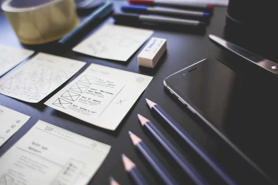
Wireframes are simple grayscale layouts that define structure, content priority and interactions without visual styling. Keeping them deliberately plain focuses feedback on whether the screen works, not whether stakeholders like the color.
- Begin with quick paper or whiteboard sketches to explore several layouts in minutes.
- Move the best options into Figma at real device sizes so content length and thumb reach are realistic.
- Use real or realistic content. Placeholder text hides problems with long names, prices and translations.
- Design the first-run experience carefully; our guide to app onboarding UX covers how to reduce early drop-off.

Stage 4: Visual Design and UI Kit
Visual design turns approved wireframes into polished, on-brand screens built from a consistent set of components. This is where typography, color, iconography and motion are defined.
Designers usually present two or three style directions on a few key screens, then apply the chosen direction across the app. Platform conventions matter: Apple’s Human Interface Guidelines recommend touch targets of at least 44 by 44 points, and Google’s Material Design recommends 48 by 48 density-independent pixels. Cross-platform apps often share most of the design but keep platform-specific details such as navigation patterns, date pickers and system sheets.
Build the UI kit as reusable components with variants and states from day one. It speeds up the rest of the project and becomes the foundation of a design system as the product grows. Check color contrast and text sizes against the WCAG accessibility guidelines as you go, and support dynamic type sizes.
Stage 5: Interactive Prototype
An interactive prototype links screens together so people can tap through the app on a real phone as if it were built. It is the cheapest way to experience the product before writing code.
Prototype the core journeys rather than every screen, and include realistic transitions, keyboard states and error messages. Prototypes also help win buy-in from investors and stakeholders. Our Figma prototyping best practices article explains how to build prototypes that are fast to update and convincing to test.
Stage 6: Usability Testing
Usability testing means watching real target users attempt specific tasks with the prototype and noting where they hesitate, misunderstand or fail. Testing with five users per round typically uncovers the most serious problems.
- Write three to five realistic tasks, for example “Book a table for four this Friday.”
- Recruit participants who match your target users, not colleagues.
- Ask them to think aloud and avoid helping them.
- Record task success, time and points of confusion.
- Fix the biggest issues, then test again.
Stage 7: Developer Handoff and Design QA
Handoff gives developers everything they need to build the design accurately, and design QA checks that what was built matches what was designed. Both are often underestimated.
- Organize Figma files with clear page names, final-screen labels and annotations for behavior that a static screen cannot show.
- Use shared design tokens for color, spacing and type so values map directly to code.
- Export icons and images in the right formats and resolutions for iOS and Android.
- Hold a walkthrough session with developers, then review builds every sprint and log visual bugs.
Common Mistakes in the Design Process
The most costly mistake is jumping straight to high-fidelity screens. Polished visuals make stakeholders approve flows that have never been tested. Other frequent problems include designing only for the latest large phones, ignoring offline and error states, treating accessibility as a final check, and leaving developers out of design reviews until handoff, when technical constraints surface too late.
What Does Mobile App Design Cost?
Designing a mobile app MVP typically costs $8,000 to $30,000, while complex apps with extensive research and a full design system can reach $60,000 or more. These are indicative ranges; your final quote depends on scope, number of screens, platforms and research depth.
The main factors that move a design budget up or down are:
- Number of unique screens and user roles, for example a customer app plus a driver app and an admin panel.
- Research depth, from a short discovery workshop to multiple rounds of interviews and usability testing.
- Brand maturity: an existing brand guide saves time, while creating a visual identity from scratch adds it.
- Custom illustration, animation and motion, which add craft time beyond standard components.
Frequently Asked Questions
How long does it take to design a mobile app?
A focused MVP usually takes six to ten weeks from discovery to a tested prototype. Larger apps with many user roles can take three to four months.
What is the difference between a wireframe and a prototype?
A wireframe is a static, low-fidelity layout showing structure. A prototype is interactive: screens are linked so users can tap through flows, and it can be low or high fidelity.
Should I design for iOS and Android separately?
Most teams create one shared design and adapt platform-specific elements such as navigation, controls and system dialogs. Fully separate designs are rarely worth the extra cost unless the app relies heavily on native platform features.
Can development start before design is finished?
Yes, once flows and wireframes are approved. Backend and architecture work can begin while visual design is completed, and front-end work follows screen by screen.
Design Your App With Sigmato
Sigmato’s designers take apps from research and wireframes to Figma UI design and tested interactive prototypes, then work with our developers to build them. Share your idea and we will outline a design plan and budget.
Sources and References
